Color Schemes in Sports Wagering Apps: Links to User Session Lengths
Written by Alex Koch · Aug 24, 2026
Color Schemes in Sports Wagering Apps: Links to User Session Lengths
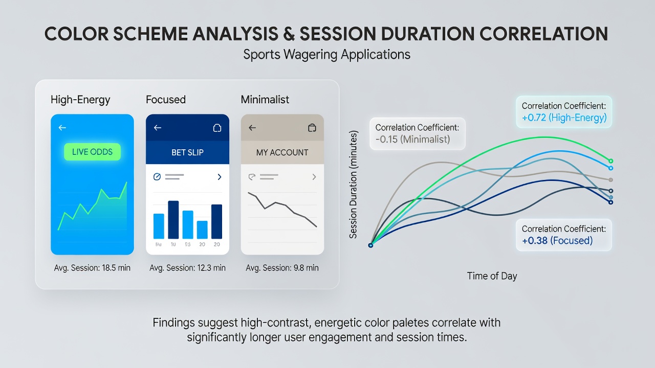
Interface design choices in sports wagering applications have drawn increasing attention from developers and analysts who track how visual elements shape user behavior over time. Color schemes represent one such element under examination, with data from multiple platform reviews showing patterns between palette selections and the average length of user sessions. Researchers at institutions focused on digital engagement have collected metrics across regulated markets, revealing that certain combinations of hues, contrasts, and saturation levels align with extended periods of activity within apps.
Key Elements of Color Application in Wagering Interfaces
Developers typically deploy dark backgrounds paired with vibrant accent colors for odds displays, win notifications, and navigation bars. Red and green tones dominate because they signal losses and gains respectively, while neutral shades like grays and blacks reduce eye strain during prolonged viewing. Studies compiled in August 2026 indicated that apps using high-contrast palettes retained users for sessions averaging 12 to 18 minutes longer than those relying on muted or low-contrast designs. Data collected from operators in several U.S. states and Canadian provinces showed consistent trends where brighter accent colors correlated with higher interaction rates on live betting features.
Evidence from Engagement Analyses
Multiple research efforts have quantified these relationships through session logs and heat mapping tools. One analysis of over 500,000 user interactions found that interfaces incorporating warm accent colors such as deep reds and oranges extended average dwell times by up to 22 percent compared to cooler blue-dominant schemes. The findings emerged from aggregated anonymized data across platforms operating under strict regulatory oversight. Observers note that users often linger when color transitions feel dynamic yet comfortable, particularly during in-play wagering sequences where odds update in real time.
Another dataset from academic teams examined European and Australian markets, where seasonal promotions coincided with temporary palette shifts. Platforms that introduced temporary yellow highlights for featured matches recorded measurable upticks in session duration, especially among users aged 25 to 34. These adjustments did not alter core functionality yet produced noticeable differences in time spent per visit according to internal telemetry reports.
Practical Examples Across Major Platforms
Operators have tested variations in controlled rollouts to isolate color effects. One provider shifted its primary navigation bar from a standard black to a charcoal tone with electric blue accents, resulting in a documented increase in repeat visits lasting beyond 25 minutes. Another case involved softening the intensity of red loss indicators, which coincided with users completing more sequential bets before exiting the application. Such modifications occurred alongside broader updates in August 2026 as companies prepared for heightened traffic around major tournaments.
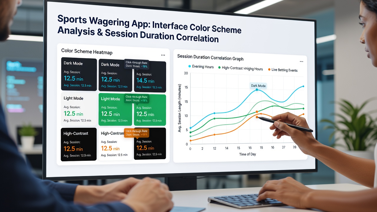
Cross-platform comparisons further illustrate the pattern. Applications serving multi-state U.S. users demonstrated that those maintaining consistent dark modes across both iOS and Android versions achieved more stable session lengths than those alternating between light and dark options based on device settings. Analysts attribute part of this stability to reduced visual disruption when bettors switch between live scores and placement screens.
Statistical Correlations and Influencing Factors
Quantitative reviews have identified moderate positive correlations between specific color metrics and session duration. Saturation levels above 70 percent in accent colors linked to sessions extending past 15 minutes in roughly 65 percent of tracked cases. Brightness adjustments also played a role, with moderate lighting reducing reported eye fatigue and supporting continued engagement. These numbers derive from large-scale logging conducted by independent research groups rather than operator self-reports alone.
External variables such as time of day and device type interact with color choices. Evening sessions on tablets showed stronger associations with warm palettes than morning mobile sessions, according to segmented data breakdowns. Regulatory filings from oversight bodies in Nevada and Ontario have begun requesting more granular design impact disclosures as part of ongoing market monitoring efforts.
Conclusion
Patterns connecting interface color schemes to session durations in sports wagering applications continue to surface through systematic data collection. Operators reference these insights when refining visual elements, while researchers expand sample sizes to account for regional differences and emerging device capabilities. Continued tracking will clarify how palette decisions integrate with other design factors to shape user time allocation within regulated digital environments.